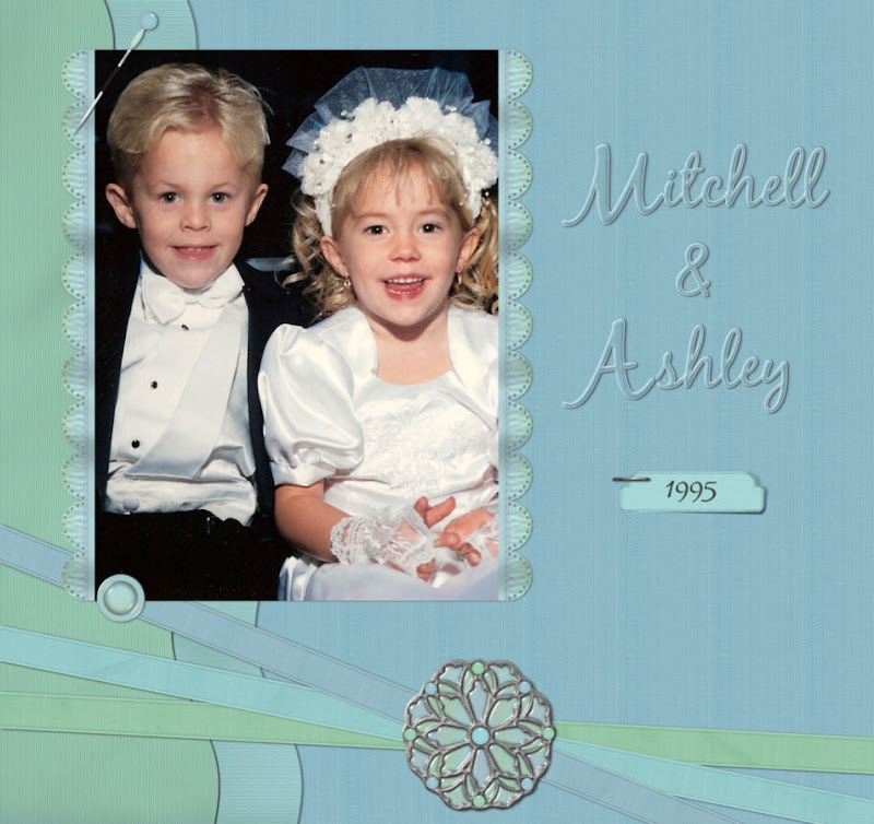
I did my first scrap...I'm so excited! I used my AshleyB Kit to scrap the grandtwins, one of which is AshleyB:). I've had this pic on my desk since 1995 when it was taken at my daughters' wedding. Just looking at them at this age makes me break out in a huge grin and I usually just soak it in for a few minutes. They are the cutest kids a grandma could ever have...but I'm just a little prejudiced...lol!
I know it's very basic but I did find out by actually doing a scrap that my stuff really sucks! Thanks for telling me that...sheesh! Things were either too big or too small so I gotta' figure out my perspective on stuff. My staple and stickpin are HUGE compared to other stuff in the kit...rofl. I shall do a scrap with a 'brand name' designer and see if I do any better but I'll sure keep this stuff in mind:) I really do need lessons in scrapping...I think I'll do a Google search and then a Yahoo! Groups search. There's gotta' be someone out there that can help me. But I'm still tickled pink about being able to do my first page:)
I'll be back after the Easter holiday with a new pic of how they look now at 15.Have a safe and wonderful and Happy Easter to all you awesome scrappers. I'm taking a long weekend and going off the air til Monday. See you next week and hope da' Bunny makes it to ya'!


7 comments:
You created a great page! Those kids are darling in that picture. It would be great to see them as they are now. I love seeing older pictures being scrapped.
I was at the 3Scrapateers chat last night too. There were quite a few people there but it was so much fun. I love just "talking" to everyone.
Great layout! The kids are so cute in their wedding attire! Would love to see a current pic of them! Have a blessed Easter!
I think the first rule is to create in 300ppi...that way you get good print quality. Second make things bigger rather than smaller. Take brads for example. Real brads are 1/4 of an inch or smaller (usually) I usually make mine close to an inch in case someone wants then a little bigger for something. sizing smaller usually isn't a problem. Next rule, try not to add shadows to elements (edges). Some of my actions add shadows or "glows". I have left them on older elements, but now that I am aware I try to get rid of them.
What else, check for stray pixels. oh, and save elements each to their own file when possible...some cannot work with them when there are a lot on one file.
These are just "good ideas" to keep in mind. I think you have great ideas on what you create. The rest will come. I do think using your own designs on layouts now and then will help you in all aspects of designing.
Thanks so much Ruby...that is fantastic info for me and I sure appreciate it:)
Your first layout looks great. If your stuff is too big theres aways that resize button lol. TFS
I think you are doing a fantastic job of creating! And, with grandkids that cute, who really cares what anyones else thinks, right? :)
I may be challenged, but I couldn't find your email to let you know that I created a LO with your spring set...and posted it at the following:
http://www.scrapgal.com/phpBB2/album_showpage.php?pic_id=13628
Hope you like it!
korib...what a great scrap page. And I LOVED the wonderful journaling you did on it...what a great story:)
You really know how to scrap girl...it was excellent! Thanks for showing me...I really appreciate that!
Post a Comment